3Assignment 3 - Normal distributions and the Galton board
EVR-5086 Fall 2025
Author
Adyan Rios
Published
September 24, 2025
Assignment 3 - Normal distributions and the Galton board
For this assignment follows the readings and exercises in “Risk Analysis in the Earth Sciences: A Lab Manual with Exercises in R” Version 3.
3.1 Exercise 1
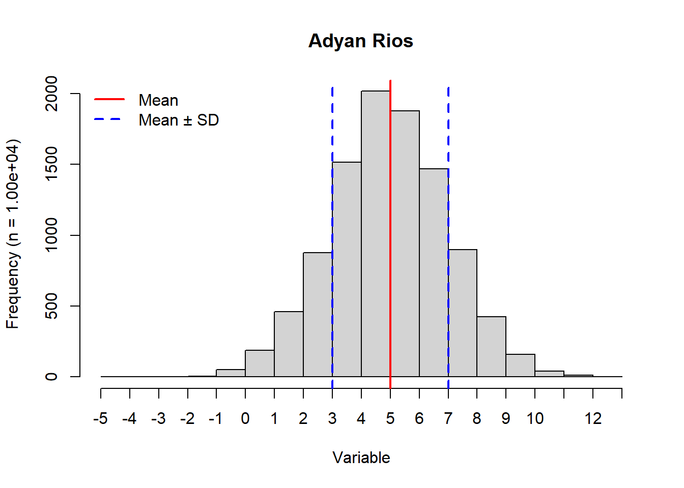
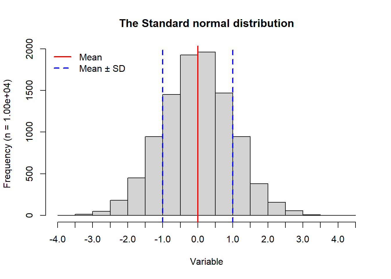
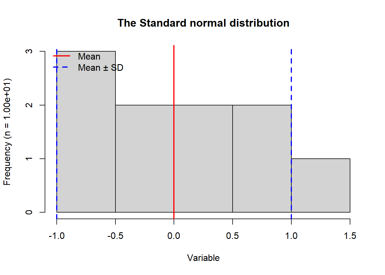
In this exercise I modified the provided lab0_sample.R to produce a histogram based on 104 samples from a normal distribution with mean 5 and standard deviation 2 Figure 3.1. I then produced two histograms for the standard normal distribution which has a mean 0 and standard deviation 1. The first was based on 104 samples (Figure 3.2) and the second one included only 10 samples (Figure 3.3). In addition to the modifications outlined by the exercise, I included a legend on each plot, and I dynamically read sample size into the y-axis label. I organized my code using variable names that differed by the subscript (1-3) associated with each of the three respective histograms. A main difference between Figure 3.1 and the other two histograms is how the distribution is centered around the mean of 5 and has a wider range of values compared to Figure 3.2. These differences are driven by the differences in the respective means and standard deviations. Since the first two histograms have a large number of samples being drawn from the normal distribution function rnorm(), they resulting plots show the expected bell curve shape. However, since the third histogram (Figure 3.3) is based on only 10 samples, we do not see the definition of the bell curve at all. When only using 10 samples, the standard normal distribution results in a smaller range of values than it did with 104 samples. When the number of samples is large, there are more opportunities for values to be sampled. I explore the related probability density in the next part of this exercise.
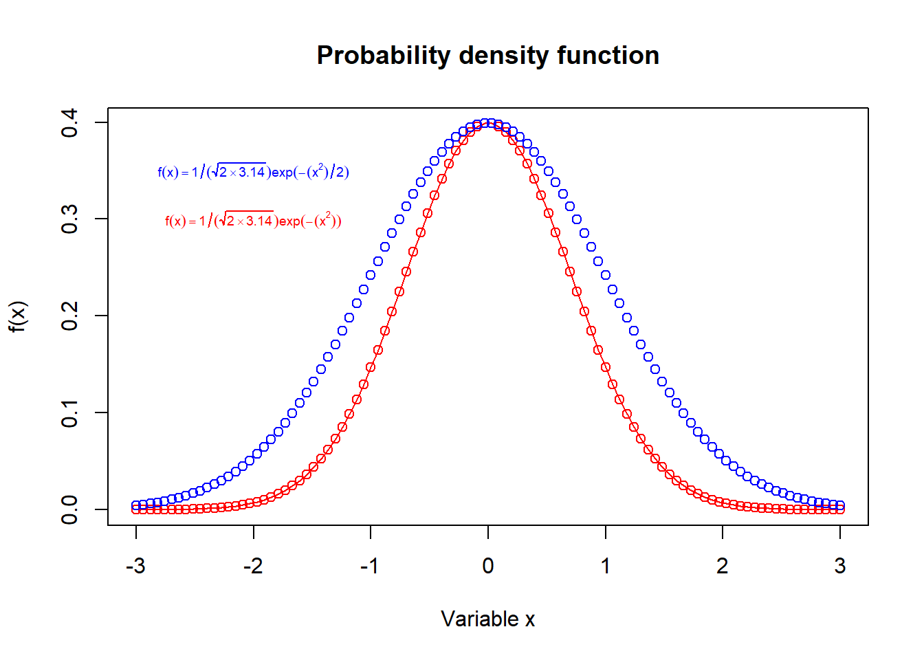
In the final part of this first exercise, I plotted the formula for the normal distribution provided in EVR-5086 Assignment 3 (Figure 3.4). I noticed a small difference between the equation in the assignment and the one on Wikipedia, which I included in the same plot as a second curve in blue. Overall, exploring these formulas helped me better understand how normal distribution’s characteristic symmetric bell curve shape is driven in its formula by e-x2. As shown in the examples in Figure 3.4 larger the value in the exponential term of the natural log, the wider the distribution. In this exercise I do not need to use the full formula that is on Wikipedia because, when mean is 0 and the standard deviation is 1, some constant multipliers simplify to 1. In the R code, I used text() and expression() to include color-coded mathematical expressions in the top-left corner of the plot.
3.1.1 Modify code from lab0_sample.R
# Modified code from lab0_sample.R# Set valuesnum_1 <-10^4# number of random drawsmu_1 <-5# mean of normal distribution to draw fromsigma_1 <-2# standard deviation of normal distribution# Sample randomly from a normal distribution x_1 <-rnorm(n = num_1, mean = mu_1, sd = sigma_1)# Plot the results as a histogramhist_1 <-hist( x_1, # Vector for the histogrammain ="Adyan Rios", # Set title to my namexlab ="Variable",ylab =paste0("Frequency (n = ", sprintf("%.2e", num_1), ")"),xaxt ="n"# Turn off x-axis values)# Add custom x-axis ticksaxis(side =1, at = hist_1$breaks)# Indicate meanabline(v = mu_1, lwd =2, col ="red")# Indicate mean ± SDabline(v =c(mu_1 + sigma_1, mu_1 - sigma_1), lwd =c(2), lty =2, col ="blue")# Add a legendlegend("topleft", legend =c("Mean", "Mean ± SD"), lwd =2, col =c("red", "blue"), lty =c(1, 2), bty ="n")
Figure 3.1: Histogram generated from 1.00e+04 random samples from a normal distribution associated with mean 5 and standard deviation 2. The mean is indicated by a vertical red line. Blue dashed vertical lines show the mean minus the standard deviation and the mean plus the standard deviation.
3.1.2 The Standard normal distribution
# Set valuesnum_2 <-10^4# number of random drawsmu_2 <-0# mean of normal distribution to draw fromsigma_2 <-1# standard deviation of normal distribution# Sample randomly from a normal distribution x_2 <-rnorm(n = num_2, mean = mu_2, sd = sigma_2)# Plot the results as a histogramhist_2 <-hist( x_2, # Vector for the histogrammain ="The Standard normal distribution", # Set title xlab ="Variable", ylab =paste0("Frequency (n = ", sprintf("%.2e", num_2), ")"),xaxt ="n"# Turn off x-axis values)# Add custom x-axis ticksaxis(side =1, at = hist_2$breaks)# Indicate meanabline(v = mu_2, lwd =2, col ="red")# Indicate mean ± SDabline(v =c(mu_2 + sigma_2, mu_2 - sigma_2), lwd =c(2), lty =2, col ="blue")# Add a legendlegend("topleft", legend =c("Mean", "Mean ± SD"), lwd =2, col =c("red", "blue"), lty =c(1, 2), bty ="n")
Figure 3.2: Histogram generated from 1.00e+04 random samples from a normal distribution associated with mean 0 and standard deviation 1. The mean is indicated by a vertical red line. Blue dashed vertical lines show the mean minus the standard deviation and the mean plus the standard deviation.
3.1.3 The Standard normal distribution with only 10 samples
# Set valuesnum_3 <-10# number of random drawsmu_3 <-0# mean of normal distribution to draw fromsigma_3 <-1# standard deviation of normal distribution# Sample randomly from a normal distribution x_3 <-rnorm(n = num_3, mean = mu_3, sd = sigma_3)# Plot the results as a histogramhist_3 <-hist( x_3, # Vector for the histogrammain ="The Standard normal distribution", # Set title xlab ="Variable",ylab =paste0("Frequency (n = ", sprintf("%.2e", num_3), ")"),xaxt ="n"# Turn off x-axis values)# Add custom x-axis ticksaxis(side =1, at = hist_3$breaks)# Indicate meanabline(v = mu_3, lwd =2, col ="red")# Indicate mean ± SDabline(v =c(mu_3 + sigma_3, mu_3 - sigma_3), lwd =c(2), lty =2, col ="blue")# Add a legendlegend("topleft", legend =c("Mean", "Mean ± SD"), lwd =2, col =c("red", "blue"), lty =c(1, 2), bty ="n")
Figure 3.3: Histogram generated from 1.00e+01 random samples from a normal distribution associated with mean 0 and standard deviation 1. The mean is indicated by a vertical red line. Blue dashed vertical lines show the mean minus the standard deviation and the mean plus the standard deviation.
3.1.4 Plotting the normal distribution from Wikipedia
a <-seq(-3, 3, length.out =100)plot(a, 1/ (sqrt(2*3.14)) *exp(-(a^2)), col ="red", type ="o",main ="Probability density function",xlab ="Variable x", # Label x-axisylab ="f(x)") # Label x-axispoints(a, 1/ (sqrt(2*3.14)) *exp( -(a^2) /2), col ="blue")text(-2, 0.35, expression(f(x) ==1/ (sqrt(2%*%3.14)) *exp( -(x^2) /2)), col ="blue", cex =0.6)text(-2, 0.3, expression(f(x) ==1/ (sqrt(2%*%3.14)) *exp( -(x^2))), col ="red", cex =0.6)
Figure 3.4: Probability density plot for the normal distribution. The standard normal distribution (mean 0 and standard deviation 1) is shown by the curve in blue. Meanwhile, a normal distribution is also plotted in red with a slightly simplified equation.
3.2 Exercise 2
In this part of the assignment, I plotted sea-level data and temperature rates of change over time. To save time when re-running the code, I added if statements that only download the data if they do not exist locally.
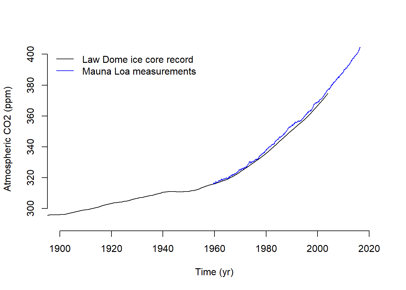
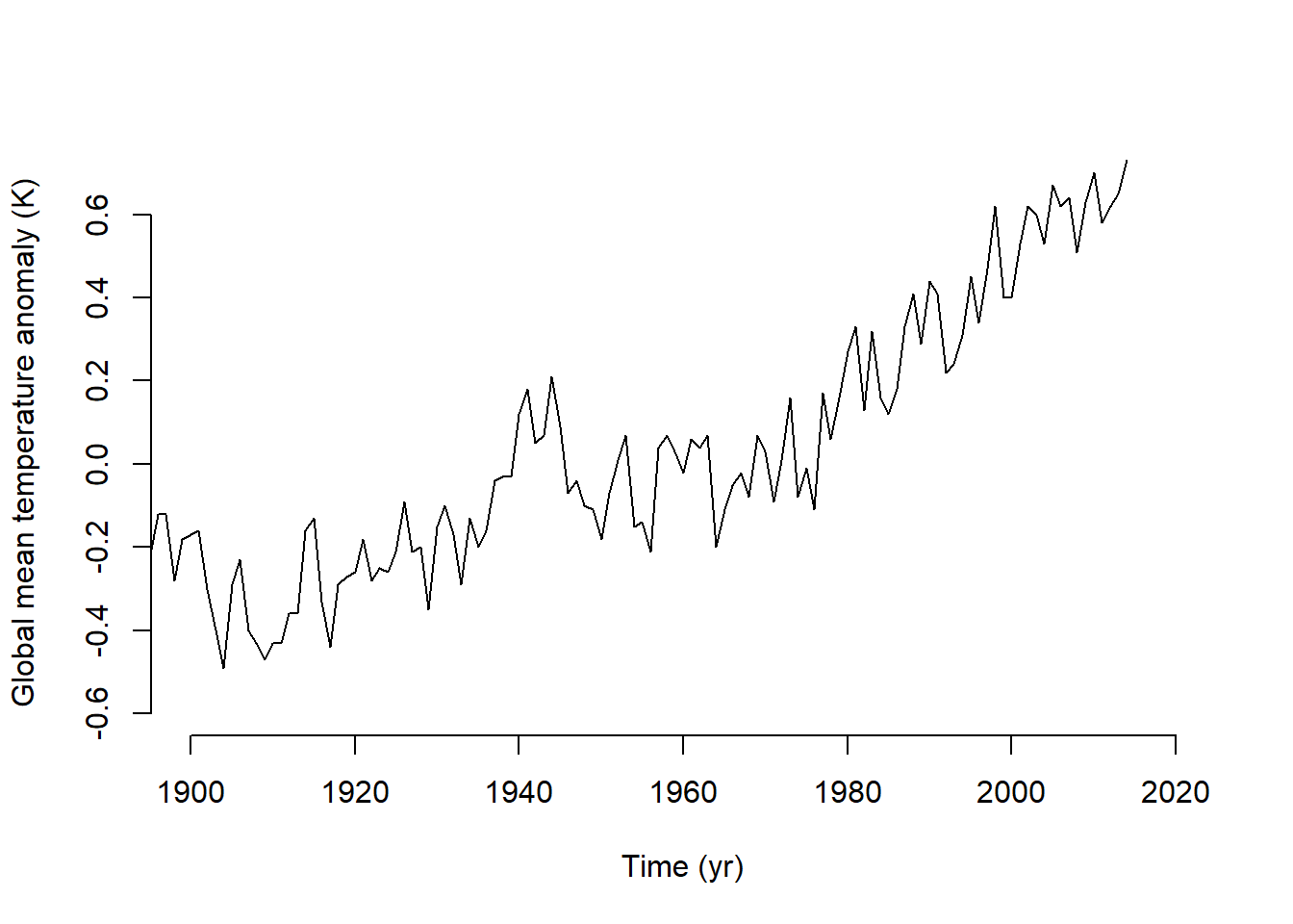
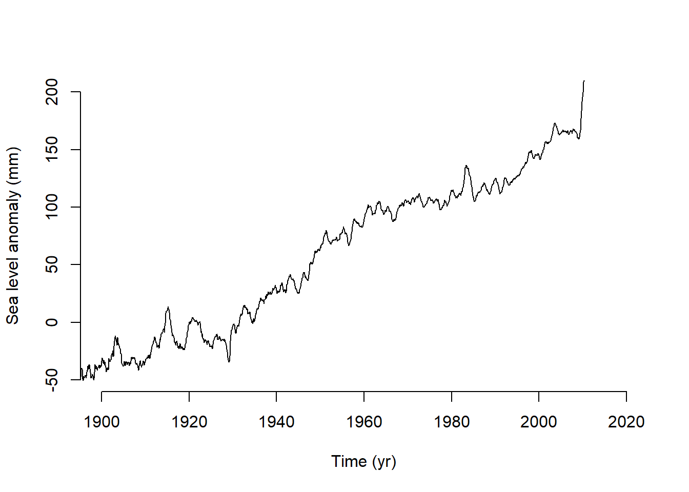
I ran into a couple early challenges. First, working with .txt files was a little challenging because I am used to .csv files, which usually already have descriptive column names and straightforward data frame structures. In trying a few options for how to read in the sea level data, I learned how to automatically ignore the comments beginning with “%” which streamline my code so I did not have to hard-code the lines to read. The next challenge was the way the time variable. I had not worked with decimal dates before, but I used date_decimal() from the lubridate to extract the dates into a format that was easier for me to interpret In reproducing and saving the three-panel plot (Atmospheric CO₂ (top), global mean surface-air temperature anomaly (middle), and global mean sea level anomaly (bottom)), I followed the code provided in lab1_sample.R. I then reproduced it in a multi-panel plot that renders directly in this document (Figure 3.5).
To answer how much atmospheric carbon dioxide concentrations, global mean temperatures, and sea levels changed between 1900 and the early part of the present century I subset each data set into “early” (1900-1910) and “recent” (2000-2010) and compared the mean values. The atmospheric carbon increased by 25.64 ppm (73%). Temperature and sea level both fluctuate between seasonally, but similar to the change seen for CO2, they also increased over those 100 years. The mean temperature increased by 0.93 degrees, and the mean sea level increased by 194 mm.
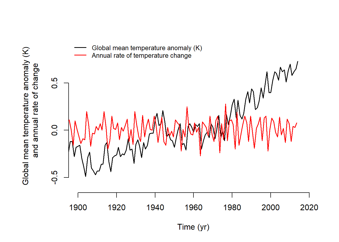
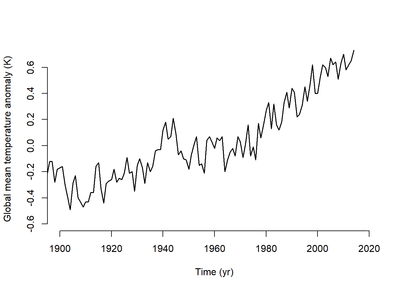
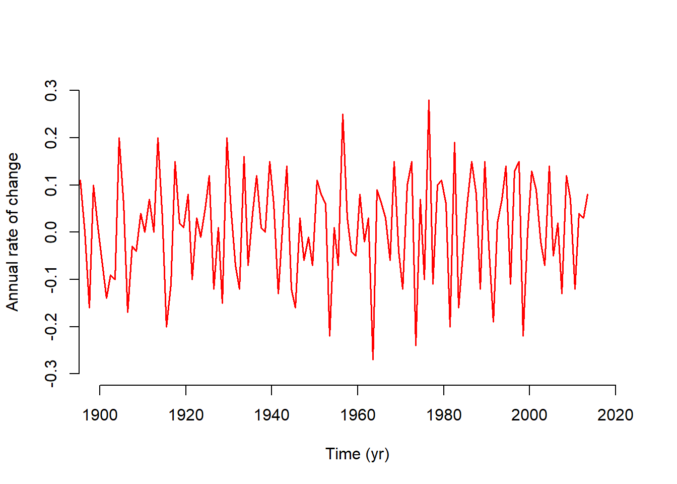
The last part of Exercise 2 involved calculating the rates of temperature change. I checked the data source to clarify why I was using column 14 and why the value was being divided by 100. I learned that the anomalies are stored as hundredths of a degree. Also, column 14 reflects information summarized across the 12 months, which are also provided in separate columns. Initially, I plotted the rate of change on the same axis as the original data series (Figure 3.6) using a red line for the rate and adding a legend. I also produced separate panels to more easily compare them (Figure 3.7). The results show that prior to 1970 there are fewer years with extreme increases or decreases. After the 1970, the dips and peaks are consistently more extreme in both direction. Although there are a few strong dips in the later half of the time series, summing over the values, indicated that the increases are more extreme overall. This corresponds with the upward trend observed in the global mean temperature anomaly plot, where the cyclical nature of the series is also evident.
3.2.1 Sea level anomaly data
# Check if libraries are installed; install if not.if (!require("pacman")) install.packages("pacman")pacman::p_load(here, lubridate, ggplot2)
# Create a folder for storing downloaded filesif (!file.exists(here("assignment3/data"))) {dir.create(here("assignment3/data"))}# Download and read in the sea level anomaly data from Jevrejeva et al. (2014)if (!file.exists(here("assignment3/data/jevrejeva2014_gmsl.txt"))) {download.file("https://psmsl.org/products/reconstructions/gslGPChange2014.txt",here("assignment3/data/jevrejeva2014_gmsl.txt") )}# Read in and ignore lines with comments (starting with %)sl.data <-read.table(here("assignment3/data/jevrejeva2014_gmsl.txt"), comment ="%")# Assign column namescolnames(sl.data) <-c("time", "rate_mm", "rate_err_mm", "gmsl_mm", "gmsl_err_mm")# Format datesl.data$date_decimal <- lubridate::date_decimal(sl.data$time)
# Conditionally download files used in lab1_sample.Rif (!file.exists(here("assignment3/data/co2_mm_mlo.txt"))) {download.file("ftp://aftp.cmdl.noaa.gov/products/trends/co2/co2_mm_mlo.txt",here("assignment3/data/co2_mm_mlo.txt") )}if (!file.exists(here("assignment3/data/law2006.txt"))) {download.file("ftp://ftp.ncdc.noaa.gov/pub/data/paleo/icecore/antarctica/law/law2006.txt",here("assignment3/data/law2006.txt") )}if (!file.exists(here("assignment3/data/GLB.Ts+dSST.txt"))) {download.file("http://data.giss.nasa.gov/gistemp/tabledata_v3/GLB.Ts+dSST.txt", here("assignment3/data/GLB.Ts+dSST.txt") )}# Read in the CO2 data loa.co2.data <-read.table(here("assignment3/data/co2_mm_mlo.txt"),skip =57, header =FALSE)law.co2.data <-read.table(here("assignment3/data/law2006.txt"), skip =183, nrows =2004, header =FALSE)# Read in the GISS temperature data begin.rows <-c(9, 31, 53, 75, 97, 119, 141)num.rows <-c(19, 20, 20, 20, 20, 20, 14)temp.data <-matrix(NA, nrow =sum(num.rows), ncol =20)temp.data[1: num.rows[1], ] <-as.matrix(read.table("data/GLB.Ts+dSST.txt", skip = begin.rows[1], nrows = num.rows[1], header =FALSE))for (i in2:length(begin.rows)) { temp.data[(sum(num.rows[1: i-1])+1):sum(num.rows[1: i]), ] <-as.matrix(read.table("data/GLB.Ts+dSST.txt", skip = begin.rows[i], nrows = num.rows[i], header =FALSE))}
# Create a folder to store figues as pdfs if (!file.exists(here("assignment3/figures"))) {dir.create(here("assignment3/figures"))}# Plotpdf(here("assignment3/figures/lab1_sample_plot2.pdf"),width =4.5, height =6)par(mfrow =c(3, 1), cex =0.66)plot(law.co2.data[, 1], law.co2.data[, 6], type ="l", xlim =c(1900, 2020), ylim =c(290, 400), bty ="n", xlab ="Time (yr)", ylab ="Atmospheric carbon dioxide (ppm)")lines(loa.co2.data[, 3], loa.co2.data[, 5], type ="l", col ="blue")legend("topleft", c("Law Dome ice core record", "Mauna Loa measurements"), col =c("black", "blue"), lwd =1, bty ="n")plot(temp.data[, 1], temp.data[, 14]/100, type ="l", xlim =c(1900, 2020), ylim =c(-0.6, 0.7), bty ="n", xlab ="Time (yr)", ylab ="Global mean temperature anomaly (K)")plot(sl.data$time, sl.data$gmsl_mm , type ="l", xlim =c(1900, 2020),ylim =c(-50, 200), bty ="l", xlab ="Time (yr)", ylab ="Sea level anomoly (mm)")# Close the device and make the return value invisibleinvisible(dev.off())
# Re run code to print in Quarto html and pdf# CO2plot(law.co2.data[, 1], law.co2.data[, 6],type ="l", xlim =c(1900, 2020), ylim =c(290, 400),bty ="n", xlab ="Time (yr)", ylab ="Atmospheric CO2 (ppm)")lines(loa.co2.data[, 3], loa.co2.data[, 5], type ="l", col ="blue")legend("topleft",c("Law Dome ice core record", "Mauna Loa measurements"),col =c("black", "blue"), lwd =1, bty ="n")# Temperature anomalyplot(temp.data[, 1], temp.data[, 14] /100,type ="l", xlim =c(1900, 2020), ylim =c(-0.6, 0.7),bty ="n", xlab ="Time (yr)",ylab ="Global mean temperature anomaly (K)")# Sea level anomalyplot(sl.data$time, sl.data$gmsl_mm,type ="l", xlim =c(1900, 2020), ylim =c(-50, 200),bty ="n", xlab ="Time (yr)",ylab ="Sea level anomaly (mm)")
(a) Atmospheric CO2
(b) Global mean temperature anomaly
(c) Sea level anomaly (mm)
Figure 3.5: Atmospheric CO₂ (top), global mean surface-air temperature anomaly (middle), and global mean sea level anomaly (bottom), 1900–~2015.
3.2.2 lab1_sample.R Question 1
By how much have atmospheric carbon dioxide concentrations, global mean temperatures, and sea levels changed between 1900 and the early part of the present century?
# Rate of changedT_dt_1 <-diff(temp.data[, 14])/100/diff(temp.data[, 1])midpoint_t <- temp.data[-length(temp.data[, 1]), 1] + .5# GISS records sometimes use 100 to represent the average temperaturepar(mar =c(5, 7, 4, 2) +0.1)plot(temp.data[, 1], temp.data[, 14] /100, type ="l", xlim =c(1900, 2020), ylim =c(-0.6, 0.9), bty ="n", xlab ="Time (yr)", ylab ="Global mean temperature anomaly (K) and annual rate of change", lwd =1.5)lines(midpoint_t, dT_dt_1, type ="l", col ="red", lwd =1.5)# Add a legendlegend("topleft", legend =c("Global mean temperature anomaly (K)", "Annual rate of temperature change"), lwd =1.5, col =c("black", "red"), lty =1, bty ="n", cex =0.8)# Second y-axis for the rate# plot(temp.data[, 1], temp.data[, 14] / 100, # type = "l", xlim = c(1900, 2020),# ylim = c(-0.6, 0.7), bty = "n", xlab = "Time (yr)",# ylab = "Global mean temperature anomaly (K)", lwd = 1.5)# par(new = TRUE) # Prepare for second axis# plot(midpoint_t, dT_dt_1, type = "l", # xlim = c(1900, 2020), ylim = c(-0.5, 0.5),# col = "red", xaxt = "n", yaxt = "n", xlab = "", ylab = "", , lwd = 1.5)# axis(side = 4, col = "red", col.axis = "red")# mtext("Annual rate of change", side = 4, line = 3, col = "red")
Figure 3.6: Overalaid plots of global mean temperature anomaly (black) and its annual rate of change (red).
plot(temp.data[, 1], temp.data[, 14] /100, type ="l", xlim =c(1900, 2020), ylim =c(-0.6, 0.7), bty ="n", xlab ="Time (yr)", ylab ="Global mean temperature anomaly (K)", lwd =1.5)plot(midpoint_t, dT_dt_1, type ="l", col ="red", lwd =1.5, xlim =c(1900, 2020),, ylim =c(-0.3, 0.3), bty ="n", xlab ="Time (yr)", ylab ="Annual rate of change")
(a) Global mean temperature anomaly
(b) Annual rate of change
Figure 3.7: Global mean temperature anomaly (black) and its annual rate of change (red).
3.3 Exercise 3
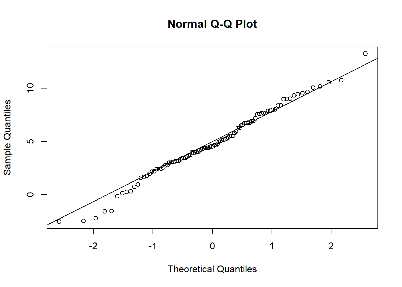
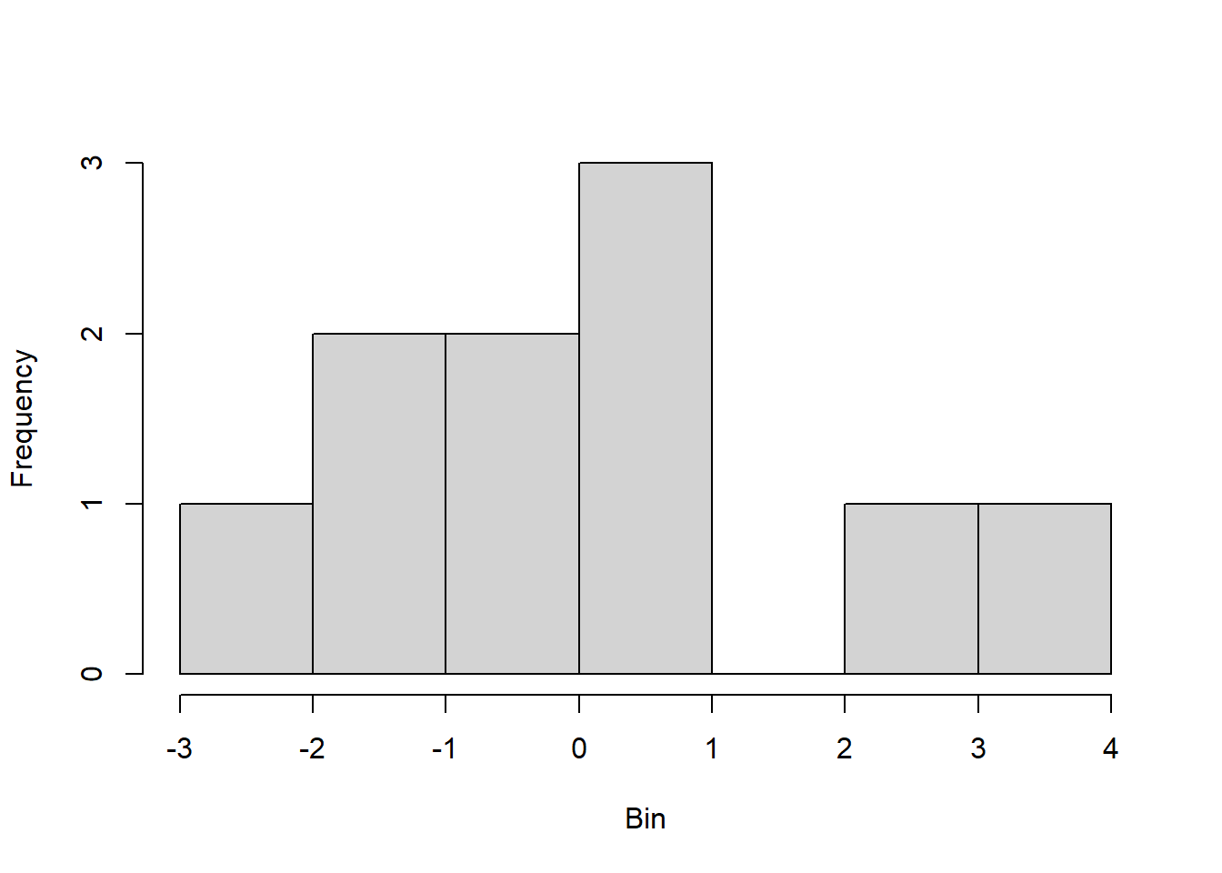
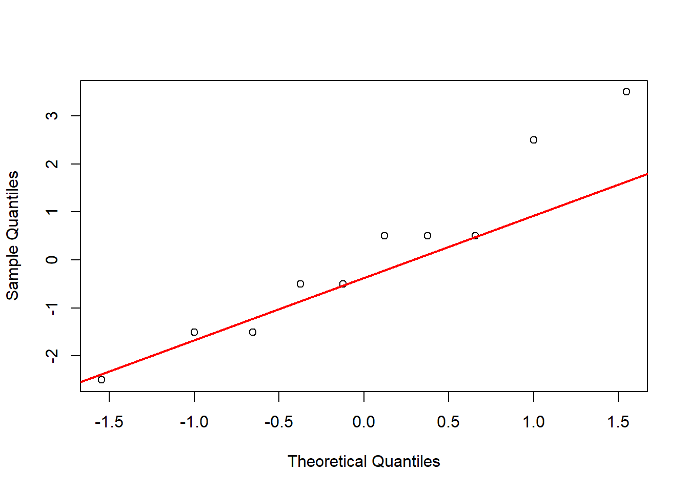
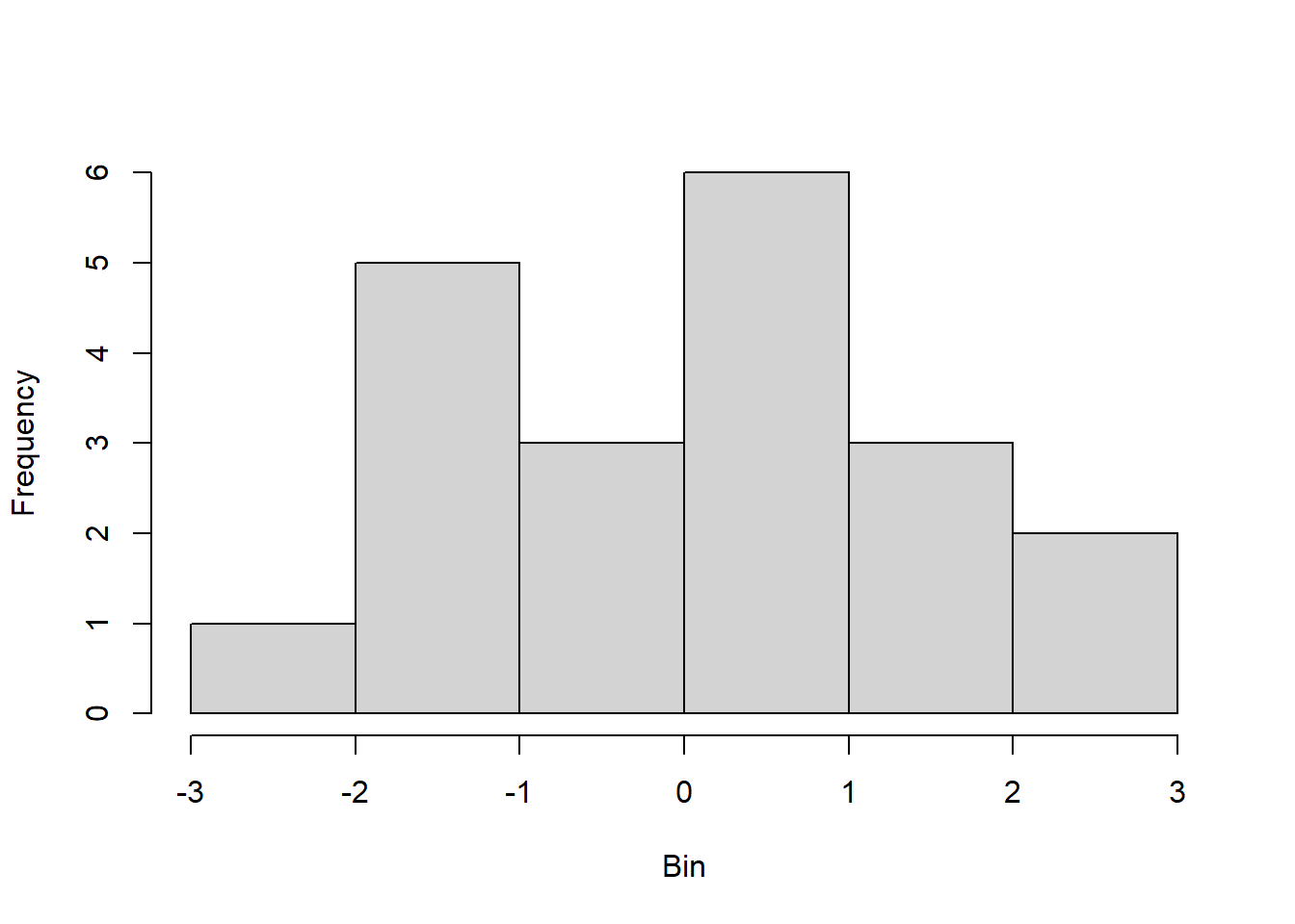
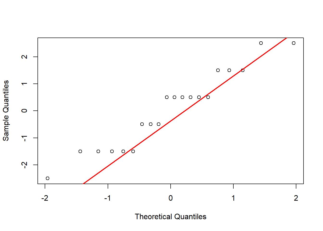
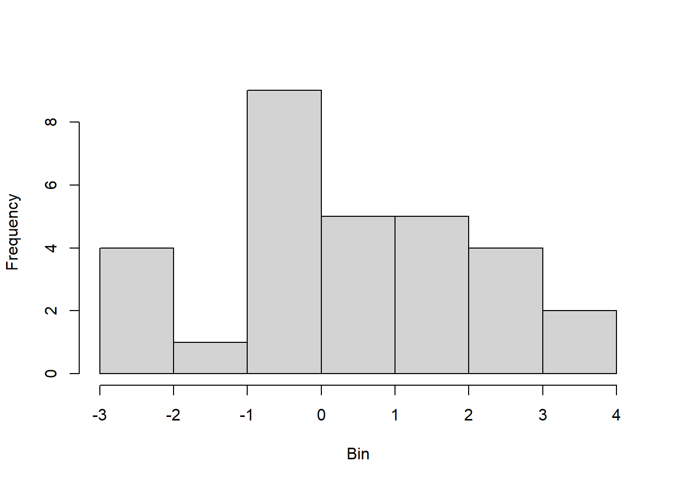
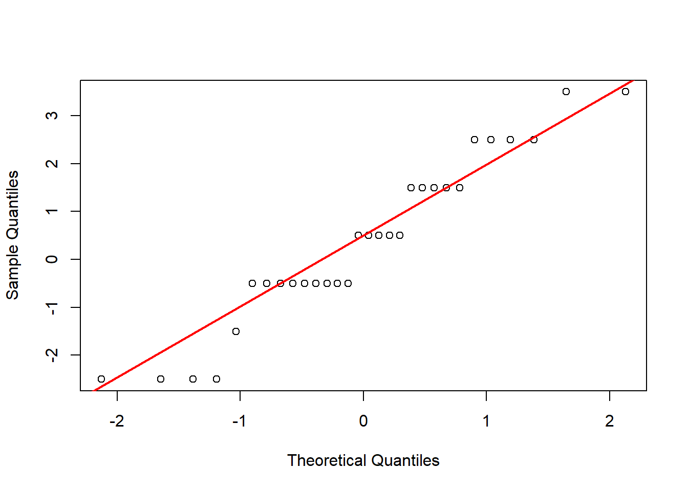
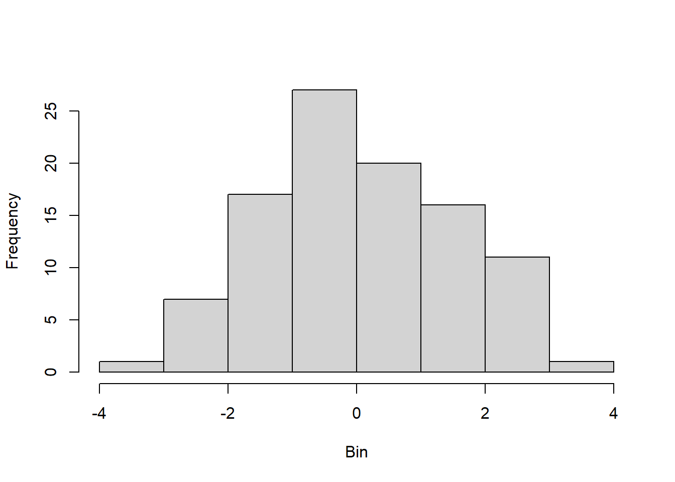
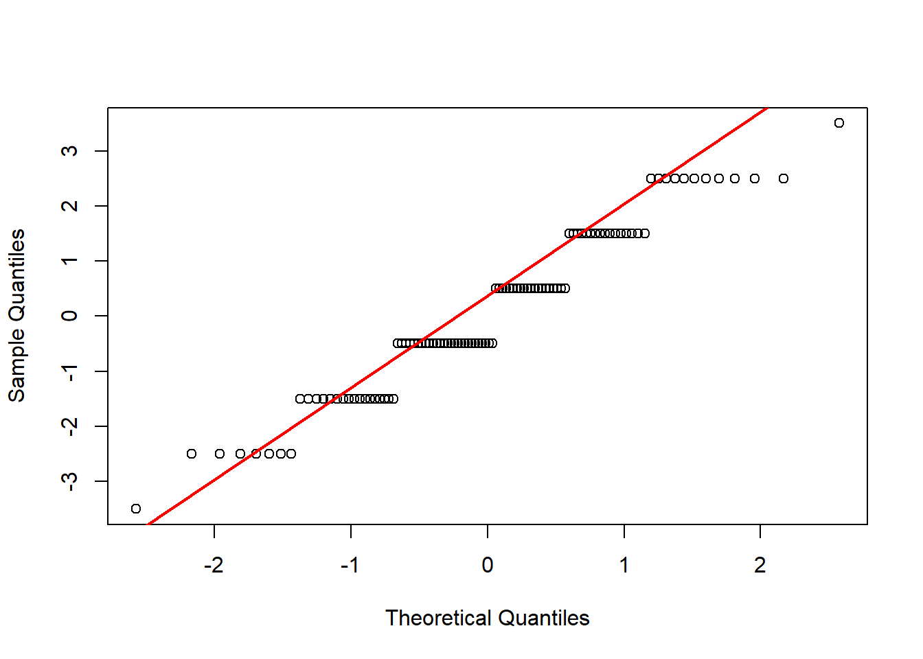
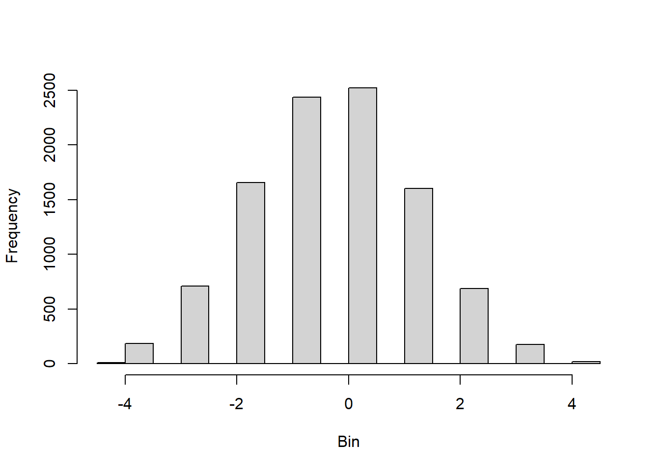
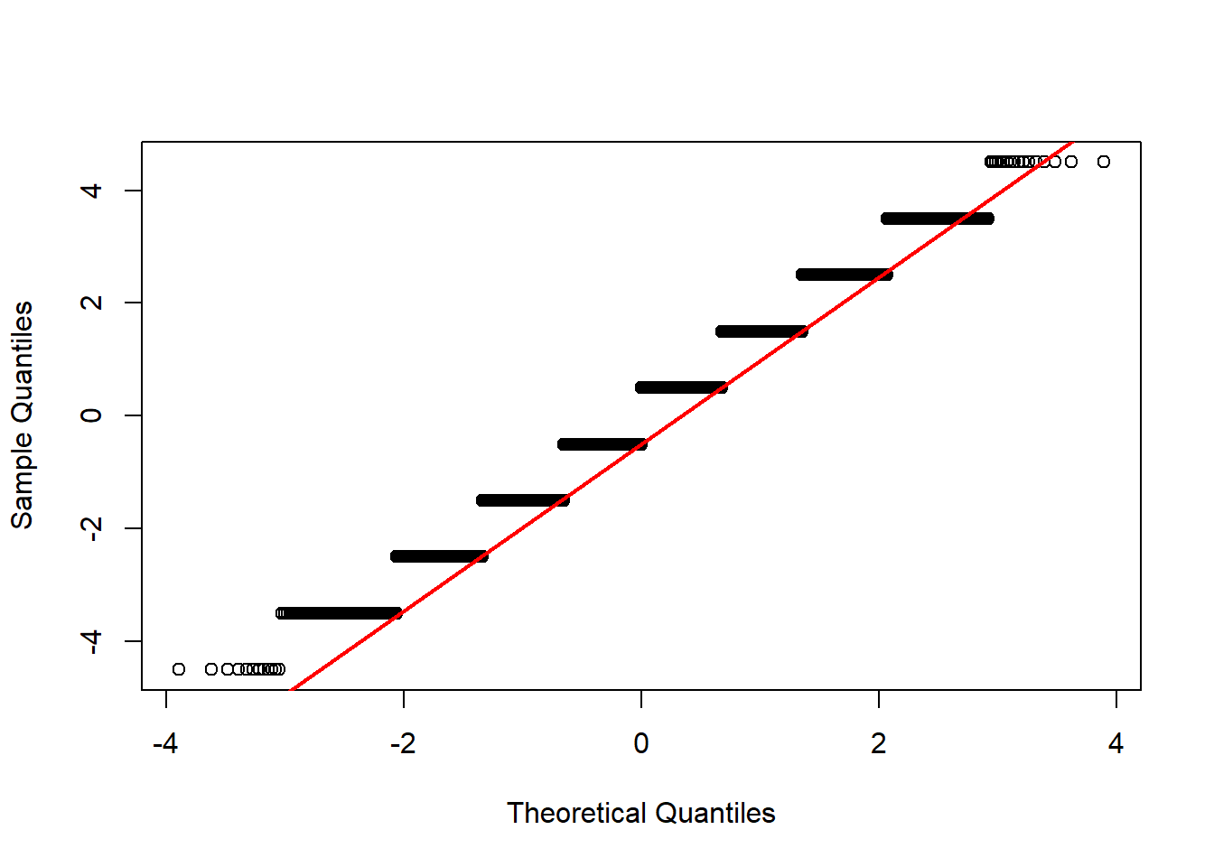
To prepare for this exercise, I included example code that was provided in the lab manual. I left it in because I reuse parts of it later, including the sampling examples to identify resulting “Galton Board” bins, and the code to generate histograms and Q-Q plots. For the actual exercise further down in this chapter, I created a function I could reuse for each variation across different number of balls. Using the function with intentional return vectors allowed me not to worry about clearing existing variables or figures from memory. I ran the function with 10 bins, and with 10, 20, 30, 100, and 10^4 balls. With 10 and 20 balls the histogram and Q-Q plot do not look normal. At about 30 balls the histogram and Q-Q plot begin to look approximately normal (Figure 4.3). Once the number of balls is large, as in the runs with 102 (Figure 4.4) and very large with 104 balls (Figure 4.5), the histogram looks normal but the Q-Q plot shows a slight departure. This may relate to the discrete and bounded nature of the bin outcomes, while the Q-Q plot may be better suited for continuous data.
3.3.1 Implement the Galton Board
# Check if libraries are installed; install if not.if (!require("pacman")) install.packages("pacman")pacman::p_load(animation)
# Set number of balls and rows following the example coden.balls <-200n.rows <-15# ani.options(nmax = n.balls + n.rows - 2)# quincunx(balls = n.balls, layers = n.rows)
# Follow example code to identify the resulting bin path <-sample(x =c(-0.5, 0.5), size = (n.rows -1), replace =TRUE)print(path)
# Example of a for loopn.times <-3for (i in1:n.times) {print(i)}
[1] 1
[1] 2
[1] 3
# Another example of a for loopn.times <-5output <-rep(1, n.times)for(i in3:n.times){ output[i] <-sum(output[(i-2):(i-1)])}print(output)
[1] 1 1 2 3 5
# Example of how to make the Q-Q plotnorm.vals <-rnorm(100, mean =5, sd =3)qqnorm(norm.vals)qqline(norm.vals)
4 Exercise
Use comments to explain what the code does and who wrote it
Clears existing variables from memory and close open figures
Set values for the number of balls to drop and the number of rows of pins
Create vector output, initially populated with NAs
Use a loop to run through values (1:n.balls), determine and store results
Make a histogram of outputs
# Develop a function to conduct the exerciserun_board <-function(n_rows, n_balls){ output <-rep(NA, n_balls) # Create vector for outputfor (i in1: n_balls){ # Loop over given number of balls path_i <-sample(x =c(-0.5, 0.5),size = (n_rows -1), replace =TRUE) output[i] <-sum(path_i) # Sum over samples to obtain bin }return(output)}
# Repeatedly run the function with different n_ballsrun5 <-run_board(n_rows =10, n_balls =10)hist(run5, main ="", xlab ="Bin", ylab ="Frequency") # Create histogramqqnorm(run5, main ="") # Create Q-Q plotqqline(run5, col ="red", lwd =2)
(a) Histogram
(b) Q-Q Plot
Figure 4.1: Results of replicating the Galton board dynamics with 10 rows and 10 balls.
# Repeatedly run the function with different n_ballsrun5 <-run_board(n_rows =10, n_balls =20)hist(run5, main ="", xlab ="Bin", ylab ="Frequency") # Create histogramqqnorm(run5, main ="") # Create Q-Q plotqqline(run5, col ="red", lwd =2)
(a) Histogram
(b) Q-Q Plot
Figure 4.2: Results of replicating the Galton board dynamics with 10 rows and 20 balls.
# Repeatedly run the function with different n_ballsrun5 <-run_board(n_rows =10, n_balls =30)hist(run5, main ="", xlab ="Bin", ylab ="Frequency") # Create histogramqqnorm(run5, main ="") # Create Q-Q plotqqline(run5, col ="red", lwd =2)
(a) Histogram
(b) Q-Q Plot
Figure 4.3: Results of replicating the Galton board dynamics with 10 rows and 30 balls.
# Repeatedly run the function with different n_ballsrun5 <-run_board(n_rows =10, n_balls =10^2)hist(run5, main ="", xlab ="Bin", ylab ="Frequency") # Create histogramqqnorm(run5, main ="") # Create Q-Q plotqqline(run5, col ="red", lwd =2)
(a) Histogram
(b) Q-Q Plot
Figure 4.4: Results of replicating the Galton board dynamics with 10 rows and 10^2 balls.
# Repeatedly run the function with different n_ballsrun5 <-run_board(n_rows =10, n_balls =10^4)hist(run5, main ="", xlab ="Bin", ylab ="Frequency") # Create histogramqqnorm(run5, main ="") # Create Q-Q plotqqline(run5, col ="red", lwd =2)
(a) Histogram
(b) Q-Q Plot
Figure 4.5: Results of replicating the Galton board dynamics with 10 rows and 10^4 balls.
4.1 Exercise 4
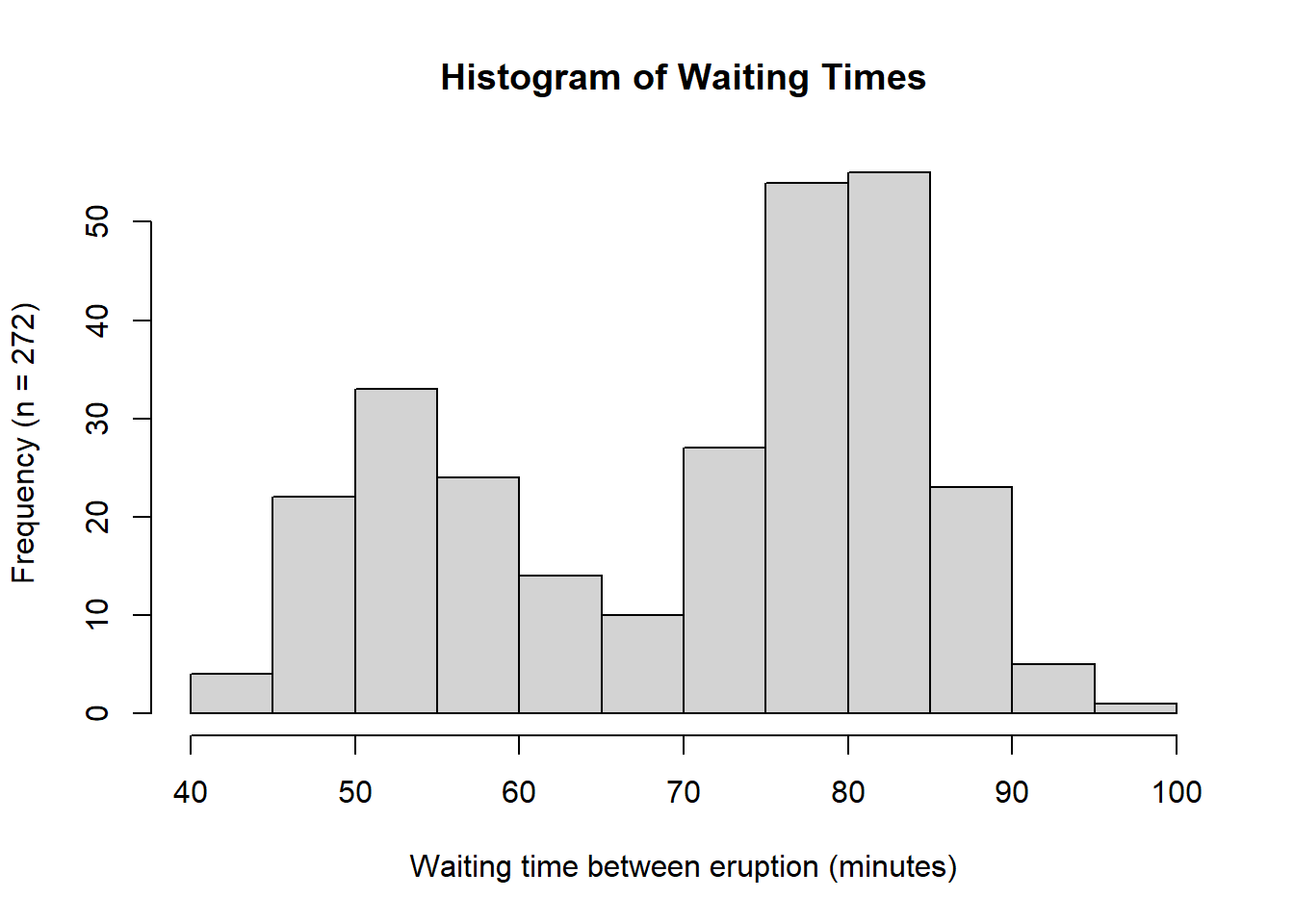
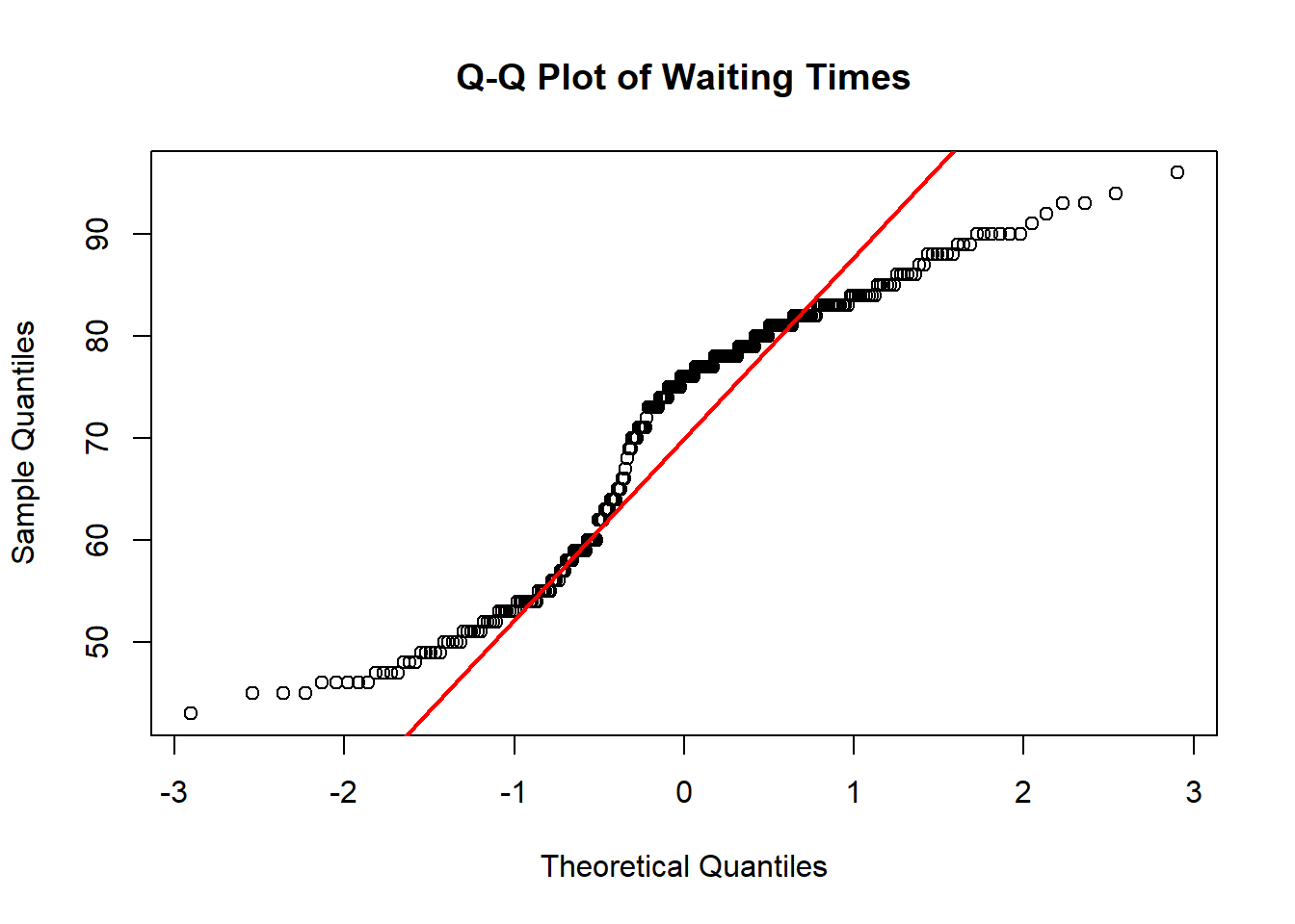
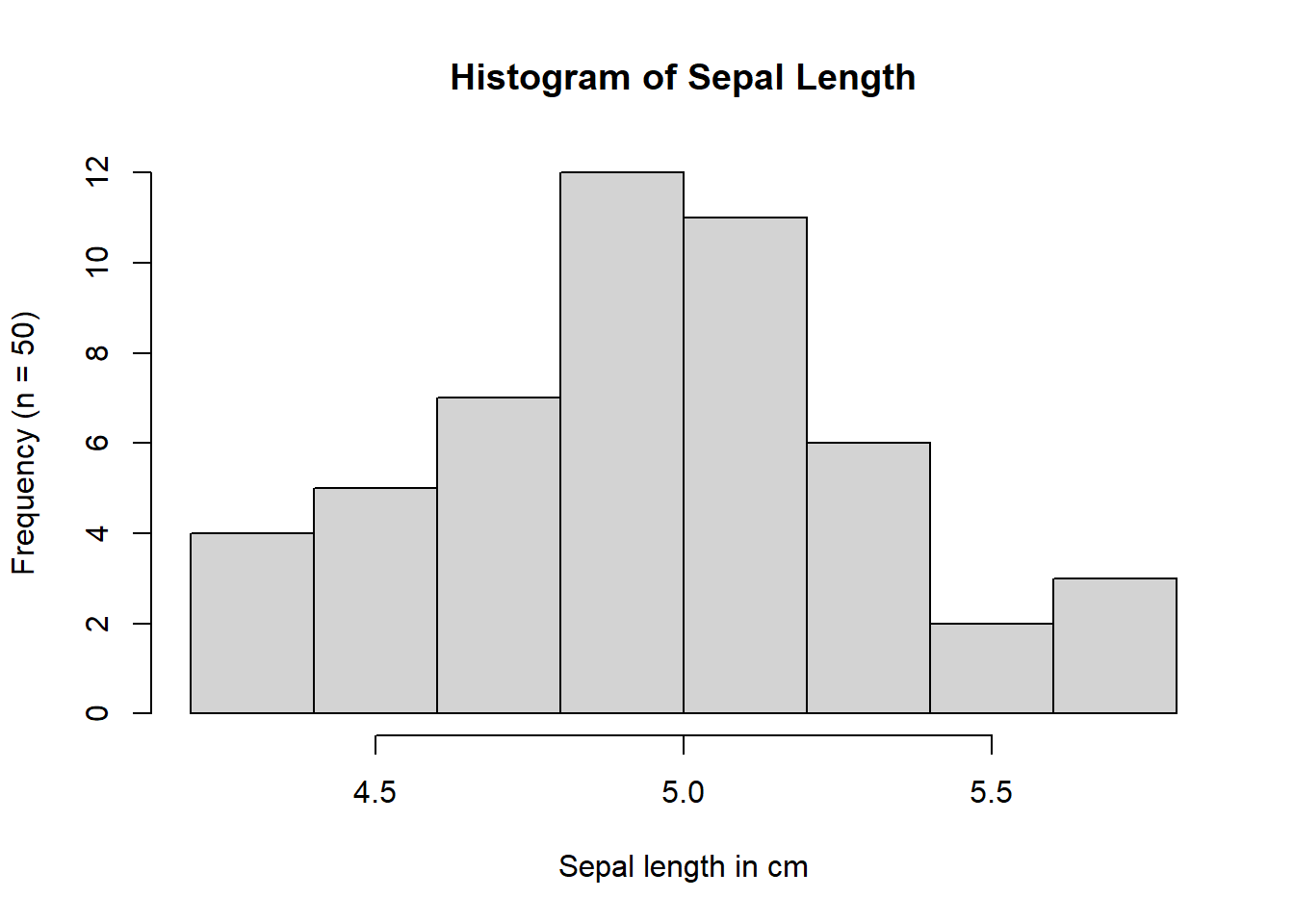
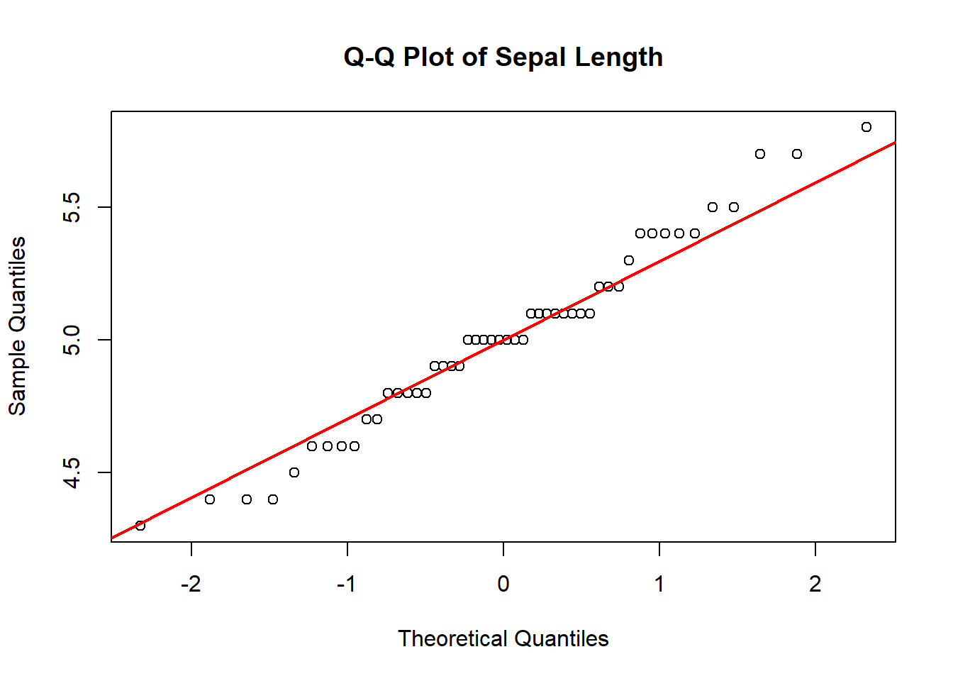
Based on the histograms and Q–Q plots, the waiting time between Old Faithful eruptions is not approximately normally distributed (Figure 4.5). The histogram is clearly bimodal, and the Q–Q plot shows systematic departures from the red reference line, indicating a lack of correspondence between the theoretical normal quantiles and the sample quantiles. By contrast, based on the shape of the histogram and the close alignment with the red line in the Q–Q plot in Figure 4.7, the sepal length data for Iris setosa appears to be approximately normally distributed.
4.1.1 Generate histograms and Q-Q plots
4.1.1.1 Old Faithful eruptions
# Histogram of waiting timeshist(faithful$waiting,main ="Histogram of Waiting Times",ylab =paste0("Frequency (n = ", length(faithful$waiting), ")"),xlab ="Waiting time between eruption (minutes)")# Q-Q plot of waiting timesqqnorm(faithful$waiting,main ="Q-Q Plot of Waiting Times")qqline(faithful$waiting, col ="red", lwd =2)
(a) Histogram
(b) Q-Q Plot
Figure 4.6: Histogram and Q-Q plot for the waiting time between eruptions of the Old Faithful geyser in yellowstone national park, WY.
4.1.1.2 Sepal length of setosa irises
# Histogram of waiting timeshist(iris3[, "Sepal L.", "Setosa"],main ="Histogram of Sepal Length",ylab =paste0("Frequency (n = ", length(iris3[, "Sepal L.", "Setosa"]), ")"),xlab ="Sepal length in cm")# Q-Q plot of waiting timesqqnorm(iris3[, "Sepal L.", "Setosa"],main ="Q-Q Plot of Sepal Length")qqline(iris3[, "Sepal L.", "Setosa"], col ="red", lwd =2)
(a) Histogram
(b) Q-Q Plot
Figure 4.7: Histogram and Q-Q plot of sepal length of setosa irises in cm.